I taught interaction design on a bachelor and master level at Malmö University for three semesters, from the height of the Covid-19 pandemic in 2021 to the strange aftermaths in 2023.
Teaching is one of the most gratifying things I have ever done. Being with students is an equally rewarding and humbling experience. Helping someone else learn pits you straight against your deep-rooted assumptions. What is evident for you is surprisingly often complete nonsense for a student—resolving such situations with empathy and understanding results in personal growth for both parties. In these moments, teaching is probably the best job in the world.
Teaching is also really hard work. Deadlines are tight to the point where every hour is accounted for and quantified. Budgets are small, and the feedback loops are on scales of courses, semesters or a student's entire education. Design is an inherently complex field that often requires the practitioner to be comfortable with multiple levels of contradiction and conflict. Interaction design, in particular, requires both aesthetic and technical achievements of students whose primary background is a general high school education.
This case study details how I approached teaching as a design problem by making small, situated pedagogical tools. Time is precious, and resources are small, so the name of the game is doing a lot with a little. These limitations manifested themselves in ixfx highlight, a VS Code plugin, Radial, a visual reference, and an exploration of Figma as a pedagogical medium.
ixfx highlight
Situational syntax
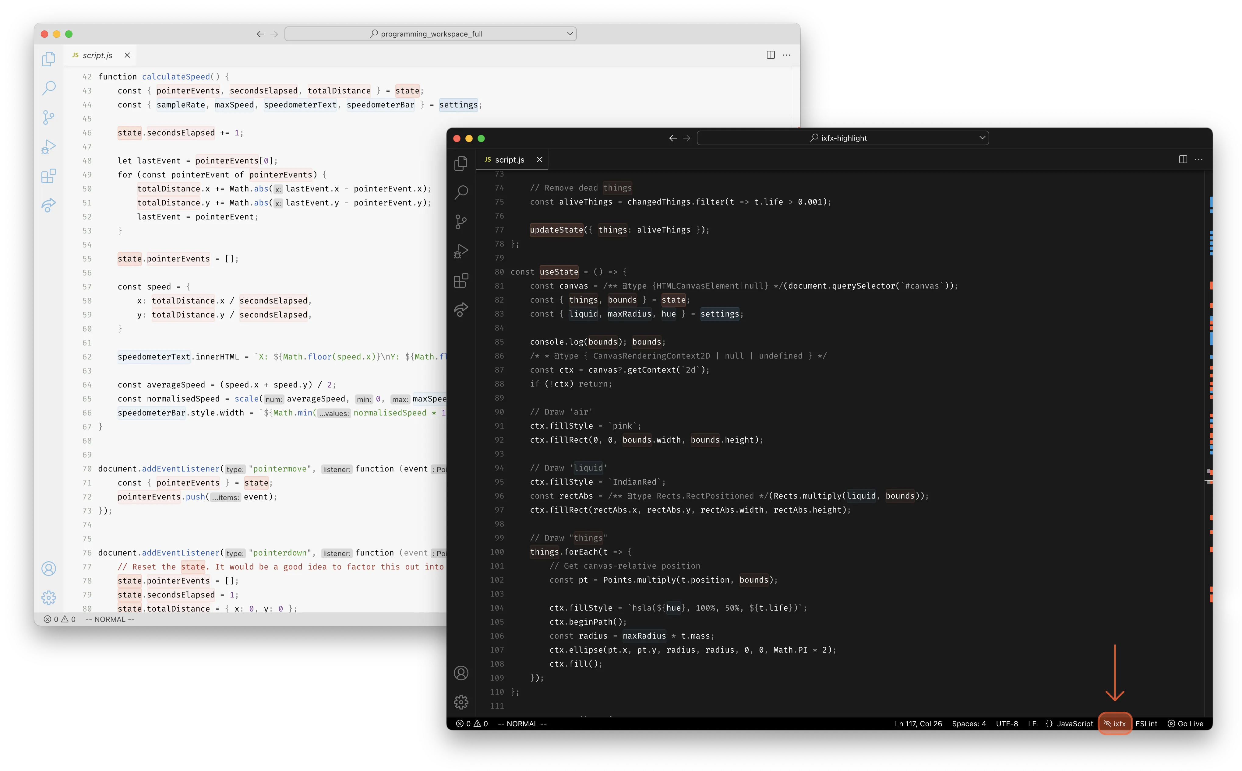
The most common question you get while running a course about programming for designers is some variation of "I don't understand where the code lives."
The literary representation of computation as source code works well enough when dealing with imperative batch processes. However, by the time you have introduced time and user input, a linear representation of your program no longer holds to the far more complex nature of emergent execution. For example, knowing "where the code lives" requires you to develop the skill of executing the program inside your head, visualizing data flow in the mind's eye.
Code editors need more affordances to aid in understanding where the code lives. Most of the help we get is in the form of generic syntax highlighting. This highlighting sets unique colors for the various syntactical elements of source code, like strings and declarations. This process creates a typographic texture that some programmers find helpful, but it does not aid in understanding your particular program.
ixfx highlight is a VS Code extension that prototypes a novel approach to situational JavaScript syntax highlighting. It assumes your code employs the conventions that we teach in the program as a heuristic to provide affordances unique to your program. A global, transnational, state and settings object pattern is employed, explicating stateful and configuration variables. The extension highlights these objects and instances used in code using a predictable background color to make it compatible with existing syntax highlighting.
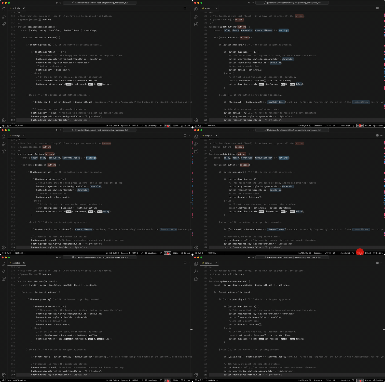
All programs feature an inarticulate distinction between problem-specific concepts and the auxiliary code that support these. The extension makes this split visible, thus affording us the ability to engage with the source in a situational fashion, the user can toggle the highlights and enable "lens" mode, dimming other identifiers, making it trivial to find where the codes live and how it moves around in the program.
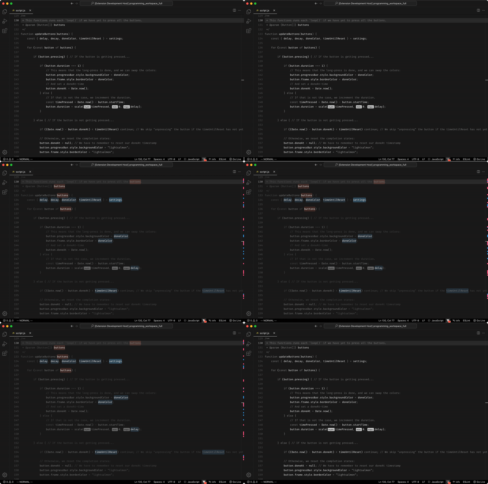
ixfx highlight is very much an MVP. VS Code does not provide access to its parse tree outside of defining concrete language grammars, so parsing is done in a separate pass using regular expressions. The heuristic only applies to code written in a niche fashion, but its situational nature makes it an exciting project. Programming tools have a deep-rooted tenancy to always aim for the most generic solution possible. However, approaching the particularities of a situation as a strength instead of a weakness manifests a far richer design space, allowing for more exciting and ultimately more productive creations.
Students are among the most open and responsive user groups you can find. Those who struggled the most with programming found little help in a splash of color, no matter how situational. However, the students who were a bit further in their understanding expressed an enjoyment not just of the additional affordances but also from a joyous sense that the editor "recognized" a unique aspect of their code. There is something to the idea of situational syntax highlighting, and I would love to explore it further in future projects.
ixfx highlight is written in TypeScript and available for download in the VS Code Store and is distributed via GitHub through an open-source license.
Radical Radial Referencer
Engaging with related work
Dealing with the deluge of prior work within a field is a large part of any professional practice. Internet search engines are great for finding trivial just-in-time knowledge but start to fall apart once you are looking for something more situational (unless it happens to be related to programming). Teaching students how to deal with this counter-intuitive fact is surprisingly challenging.
There are a million and one reference managers available, specialized in academic papers, mood boards or collaborative capturing. However, these are all generic and open-ended tools. A clean, directionless slate can be intimidating to students that need help knowing where to begin.
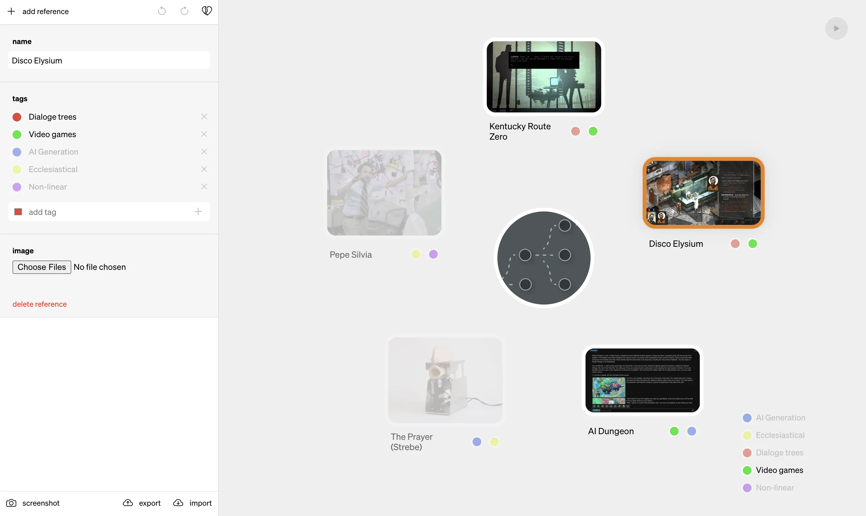
Radical Radial Referencer (RRR) is the opposite of this. Using Gaver's notion of the Annotated portfolio, my colleague Henrik Svarrer Larsen and I made a small single-page application that prescribes a specific way to work with and relate to reference work. Each reference is a captioned image with a set of tags. Once populated, the user can dynamically narrow the view to focus on subsets of tags. The resulting Radial can be saved to an image or flat file, making for simple sharing and, crucially, a single artifact for hand-in.
RRR features an interactive tutorial to prevent students from "getting stuck in the interface", a common occurrence when teaching a large group of first-year bachelor students remotely. The project was a success in that we got (see: required) students to be more conscious of how they engaged with reference projects. I wonder if they will keep using it independently, but that is not the point. RRR is a tool to get you started thinking about references through a prescribed workflow. Such a goal is not feasible for a commercial product but perfect for a small pedagogical experiment.
And yes, since you asked, it does spin.
RRR is written in Clojure(script) and is distributed via GitHub through a free and open-source license.
Self-exemplifying mediums
Figma as pedagogy

Anyone who has taken a University course since the advent of ubiquitous computing has come across the lecture pdf. These files are not just companions to a verbal presentation; they have surprisingly cross-cutting concerns. They also act as a medium for student recollection, a workbook, and, in my case, the primary course literature.
I was responsible for an intense first-year bachelor-level course called Graphical User Interfaces (GUI). We spend five weeks learning as much about the history, practice and implementation of GUIs as is physically possible without hospitalization by way of exhaustion. However, unlike more established subjects, GUI design still needs a definite or worthwhile set of course literature. As such, you got to do it yourself.
The first time I ran the course, I did everything in my old friend Keynote. That is until I had to draw some GUIs for an explanation, which is when I turned to Figma. There is nothing particular about this workflow; however, it could be more efficient once you think about it. I would draw something in Figma, save it as either a pdf or png and export that into Keynote, only so I could export it once more. This parade becomes even more convoluted once you take step-by-step screenshots illustrating the use of Figma, inside of a bitmap, inside of Keynote, inside of a pdf. My solution to this was simple, use Figma for everything.
Providing a single Figma file makes it possible to create a single place for presentation slides, midweek assignments and templates. It allows students to peek behind the curtains and see how things are built, to experiment with interactive or parameterized examples or remix the course material itself. There is no longer a distinction between the process of creating examples and the act of exploring them. The material transformed from slides into something akin to a self-exemplifying medium; an artifact simultaneously example and explanation.
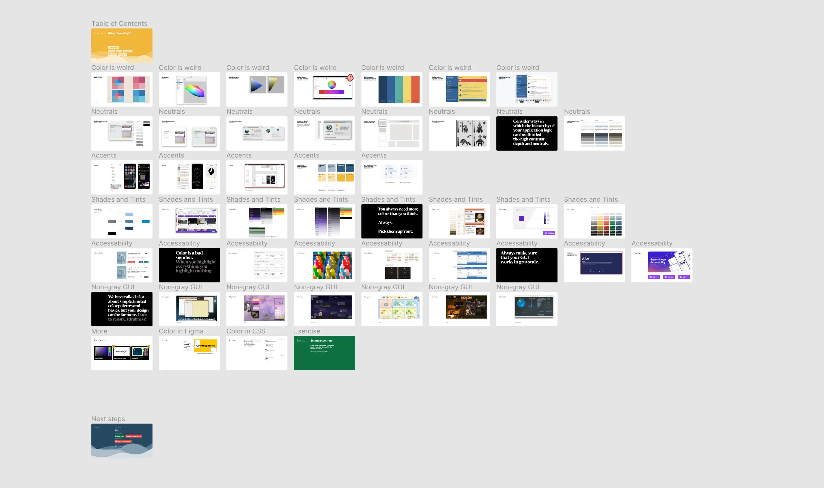
The idea of a self-exemplifying medium is not specific to Figma; any infinite canvas vector editing tool, including Keynote, would have technically done the job. Using Figma interactions as transitions for slides is powerful but also time-consuming and finicky. That said, there is something surprisingly powerful about providing a unified environment for learning. For example, context switching is mentally taxing, while allowing for immersion is one of the most potent pedagogical tools I have come across. Coupled with rich interactivity and programmability, I have a hunch that self-exemplifying mediums, or something like them, is a topic worth exploring further.
The course material for GUI is available for download in the Figma community. Some of them might only make sense in the context of the course, but I hope you find them interesting.